|
Архитектура Аудит Военная наука Иностранные языки Медицина Металлургия Метрология Образование Политология Производство Психология Стандартизация Технологии |
|
|
Архитектура Аудит Военная наука Иностранные языки Медицина Металлургия Метрология Образование Политология Производство Психология Стандартизация Технологии |
PHYSICALLY BASED RENDERING ENCYCLOPEDIAСтр 1 из 6Следующая ⇒
PHYSICALLY BASED RENDERING ENCYCLOPEDIA v. 0.96 (Dec. 19, 2017) Compiled by: Brian Yu (3py0n)
There is no one way to accomplish a task, more specifically in texturing. The below is a guideline of the most common and effective routes currently and is by no-means the only way to texture for PBR. Final name of this document is in consideration. ENJOY! Introduction An emporium/bible of sorts wherein I will try to encompass all there is to know about creating physically based materials for the next-gen. I am still new to PBR texturing and am learning as I make this bible. The reason for me making this is to have a central database for artists and developers to look at to help them with their workflow. It’s also a great way for people who are new to PBR to learn more. Please note that this is just a general guide/bible and is not the end-all-be-all. That is to say, there is typically not only 1 way of doing things. Before I finish, this document is also for people who have prior knowledge in texturing and making 3D art in general.I would like to take this opportunity to thank all the wonderfully talented and innovative people who I sourced from for their work on this subject matter. :) PS: This is more for the artistic side and less of the math/deep calculations and how it works exactly, etc.
Copyright I do not pretend to own all of what I am stating in this document. Some parts will be from my personal experience/knowledge while other parts will be excerpts taken from sources (credit will be identified at the beginning of a section).
Terms and Services of Use Please refrain from copying and pasting elsewhere as I am compiling it and would like to ensure the accuracy of the document before sharing everywhere. If there is anything that is incorrect, needs adjusting, or you would like to add to the bible, please email me with the information and source/credit and I will add it to the corresponding category. As well, if you must post this somewhere, please give credit where and when it is due.
[NEW] Update Notes This section will be used for now to outline what has been updated and when, that way readers of this doc will not have to wonder what was added.
● December 19, 2017 ○ Added a little blurb “Advances in Technology” Under the How-to section ○ Updated FAQ section ○ Added new section “Notable Artists” ● May 17, 2016 ○ Granted Sergei Karmalsky of 4A Games access to contribute ● June 11, 2015 ○ add some links to additional readings and updated FAQ to address lack of complex theory/math & equations on PBR
Table of Contents (WIP) Light Interaction & Really Sciency Stuff PBR: The Definition & More Guidelines & Basics: The How-To Guide Material Reference Values Tips & Techniques Examples Additional Readings & References FAQ Glossary & Terms Tools & Programs
Light Interaction & Really Sciencey Stuff I won’t be going through or compiling scientific formulas on how light is perceived and bounces off X material, etc. There are many other sites for that online. Instead I’ll just be compiling some basic rules of how light interactions with types of materials. This will offer a better understanding when texturing in order to achieve more realistic results!
Diffuse and Specular Reflectance ( source ) When light hits a surface, it splits into two directions: some part of it is reflected immediately while the rest gets refracted and enters the surface. The refracted light can be absorbed or can be scattered around underneath the surface and exit again at a slightly different location.
Light that gets reflected directly from the surface is handled as specular reflectance in a shading model. The light that is refracted and undergoes subsurface scattering is handled as diffuse reflectance.
The amount of light that is reflected versus refracted depends on the surface substance and the angle at which the light hits the surface. At a grazing angle, the amount of light that gets reflected directly (specular) gets higher, until it reaches 100% at an extreme angle. This behavior is described by the Fresnel effect.
Material Types ( source ) There are only two categories of substances which are relevant for rendering: metals (conductors like iron, gold, copper, etc.) and non-metals (dielectric materials like plastic, stone, wood, skin, glass, etc.). Both have special characteristics regarding diffuse and specular reflectance.
Metal has no diffuse reflection. This means that metal should have a black diffuse color. All visible light is reflected directly from the surface (specular reflectance). The different types of metal have characteristic specular colors.
Metal actually neither refracts nor absorbs ANY light, metals are so dense that light can't actually enter the surface, which is why all of the light is reflected. ( source )
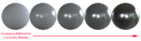
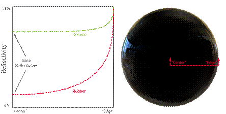
In contrast to metal, non-metal has diffuse reflection, however the specular reflection is a lot weaker and less varied than for metal. Specular reflectance for non-metal is monochromatic (no color, just gray). Most non-metals reflect only a small fraction of the light as specular, for most materials between 2% and 5%.
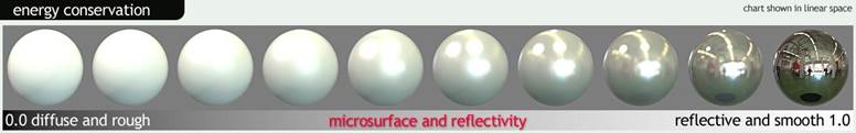
Energy Conservation ( source ) Reflection and diffusion are mutually exclusive. This is because, in order for light to be diffused, light must first penetrate the surface (that is, fail to reflect). This is known in shading parlance as an example of “energy conservation”, which just means that the light leaving a surface is never any brighter than that which fell upon it originally. This is easy to enforce in a shading system: one simply subtracts reflected light before allowing the diffuse shading to occur. This means highly reflective objects will show little to no diffuse light, simply because little to no light penetrates the surface, having been mostly reflected. The converse is also true: if an object has bright diffusion, it cannot be especially reflective.
Energy conservation of this sort is an important aspect of physically-based shading. It allows the artist to work with reflectivity and albedo values for a material without accidentally violating the laws of physics (which tends to look bad). While enforcing these constraints in code isn’t strictly necessary to producing good looking art, it does serve a useful role as a kind of “nanny physicist” that will prevent artwork from bending the rules too far or becoming inconsistent under different lighting conditions.
When the equations are properly balanced, a renderer should display rough surfaces as having larger reflection highlights which appear dimmer than the smaller, sharper highlights of a smooth surface. It is this apparent difference in brightness that is key: both materials are reflecting the same amount of light, but the rougher surface is spreading it out in different directions, whereas the smoother surface is reflecting a more concentrated “beam”:
Here we have a second form of energy conservation that must be maintained, in addition to the diffusion/reflection balance described earlier. Getting this right is one of the more important points required for any renderer aspiring to be “physically-based”.
Linear-Space Lighting & Gamma ( source ) Some more sciency information for those who are curiousity-inclined. I read it. Great read! Here is the shortened version of the shortened version. the TL:DR if you will. I’m almost making a note here incase the site goes down. It is a little dated.
The gamma colour space is 0 - 255. The neutral gray/50% is 187, not 127(128).
As of the original writing, standard monitor gamma is about 2.2, with some exceptions.
A more indepth explanation of gamma and how it affects displays (monitor, cameras, LCD on camera, etc) is given in the article. For the sake of lessening the amount of diagrams, etc I’ve omitted it.
Reflection/Specular When light hits a surface boundary some of it will reflect – that is, bounce off – from the surface and leave heading in a direction on the opposing side of the surface normal. This behavior is very similar to a ball thrown against the ground or a wall – it will bounce off at the opposite angle. On a smooth surface this will result in a mirror-like appearance. The word “specular”, often used to describe the effect, is derived from the latin for “mirror” (it seems “specularity” sounds less awkward than “mirrorness”).
Specular Colour ( source ) Good rules for specular color range of dielectric materials are: ■ No value under 0.02 ■ Common gemstones 0.05-0.17 ■ Common liquids 0.02-0.04 ■ When not finding reference for a dielectric material, setting a value of 0.04 (around plastic)
Except gemstones, any dielectric material we will use should be in the range 0.02-0.05 (more values found here).
As you can expect, you won’t spend your time finding all the refractive indices of metallic material. Especially since values are for pure laboratory material. But these specular colors can be used as references. Moreover, we can see that specular colors for metallic objects are close to what we think the color of the metal is. The basic rule for metal is to set up a value above 0.5.
Diffuse/Albedo Not all light reflects from a surface, however. Usually some will penetrate into the interior of the illuminated object. There it will either be absorbed by the material (usually converting to heat) or scattered internally. Some of this scattered light may make its way back out of the surface, then becoming visible once more to eyeballs and cameras. This is known by many names: “Diffuse Light”, “Diffusion”, “Subsurface Scattering” – all describe the same effect.
The absorption and scattering of diffuse light are often quite different for different wavelengths of light, which is what gives objects their color (e.g. if an object absorbs most light but scatters blue, it will appear blue). The scattering is often so uniformly chaotic that it can be said to appear the same from all directions – quite different from the case of a mirror! A shader using this approximation really just needs one input: “albedo”, a color which describes the fractions of various colors of light that will scatter back out of a surface. “Diffuse color” is a phrase sometimes used synonymously.
Diffuse Colour ( source ) In the past, it was usual to bake everything in a “diffuse” texture to fake lighting effects like shadow, reflection, specular… With newer engines, all these effects are simulated and must not be baked. The best definition for diffuse color in our engine is : How bright a surface is when lit by a 100% bright white light. The lighting unit for these light sources is specified as the color a white lambertian surface would have when illuminated by the light from a direction parallel to the surface normal. This mean that when you set up a light in the game editor with 1 in brightness and point it directly on a quad mapped with a diffuse texture, you get the color as displayed in Photoshop (be aware of postprocess).
One of the darkest substances on earth is charcoal, the brightest is fresh snow.
Translucency & Transparency In some cases diffusion is more complicated – in materials that have wider scattering distances for example, like skin or wax. In these cases a simple color will usually not do, and the shading system must take into account the shape and thickness of the object being lit. If they are thin enough, such objects often see light scattering out the back side and can then be called translucent. If the diffusion is even lower yet (in for example, glass) then almost no scattering is evident at all and entire images can pass through an object from one side to another intact. These behaviors are different enough from the typical “close to the surface” diffusion that unique shaders are usually needed to simulate them.
Metals Firstly, metals tend to be much more reflective than insulators (non-conductors). Conductors will usually exhibit reflectivities as high as 60-90%, whereas insulators are generally much lower, in the 0-20% range. These high reflectivities prevent most light from reaching the interior and scattering, giving metals a very “shiny” look.
Secondly, reflectivity on conductors will sometimes vary across the visible spectrum, which means that their reflections appear tinted. This coloring of reflection is rare even among conductors, but it does occur in some everyday materials (e.g. gold, copper, and brass). Insulators as a general rule do not exhibit this effect, and their reflections are uncolored.
Finally, electrical conductors will usually absorb rather than scatter any light that penetrates the surface. This means that in theory conductors will not show any evidence of diffuse light. In practice however there are often oxides or other residues on the surface of a metal that will scatter some small amounts of light.
It is this duality between metals and just about everything else that leads some rendering systems to adopt “metalness” as a direct input. In such systems artists specify the degree to which a material behaves as a metal, rather than specifying only the albedo & reflectivity explicitly. This is sometimes preferred as a simpler means of creating materials, but is not necessarily a characteristic of physically-based rendering.
Fresnel ( source ) ( source 2 ) To put it simply, fresnel is the percentage of light that a surface reflects at grazing angles.
In computer graphics the word Fresnel refers to differing reflectivity that occurs at different angles. Specifically, light that lands on a surface at a grazing angle will be much more likely to reflect than that which hits a surface dead-on. This means that objects rendered with a proper Fresnel effect will appear to have brighter reflections near the edges. Most of us have been familiar with this for a while now, and its presence in computer graphics is not new. However, PBR shaders have made popular a few important corrections in the evaluation of Fresnel’s equations.
The first is that for all materials, reflectivity becomes total for grazing angles – the “edges” viewed on any smooth object should act as perfect (uncolored) mirrors, no matter the material. Yes, really – any substance can act as a perfect mirror if it is smooth and viewed at the right angle! This can be counterintuitive, but the physics are clear. (Ex. Probably akin to asphalt looking like water/wavy mirror at extreme angles)
The second observation about Fresnel properties is that the curve or gradient between the angles does not vary much from material to material. Metals are the most divergent, but they too can be accounted for analytically.
The shading system can now handle the Fresnel effect almost entirely on its own; it has only to consult some of the other pre-existing material properties, such as gloss and reflectivity.
A PBR workflow has the artist specify, by one means or another, a “base reflectivity”. This provides the minimum amount and color of light reflected. The Fresnel effect, once rendered, will add reflectivity on top of the artist specified value, reaching up to 100% (white) at glancing angles. Essentially the content describes the base, and Fresnel’s equations take over from there, making the surface more reflective at various angles as needed. There is one big caveat for the Fresnel effect – it quickly becomes less evident as surfaces become less smooth. More information on this interaction will be given a bit later on.
Fresnel generally should be set to 1 (and is locked to a value of 1 with the metalness reflectivity module) as all types of materials become 100% reflective at grazing angles. Variances in microsurface which result in a brighter or dimmer Fresnel effect are automatically accounted for via the gloss map content. Note: Toolbag 2 does not currently support a texture map to control Fresnel intensity.
Fresnel, in Toolbag 2 and most PBR systems, is approximated automatically by the BRDF, in this case Blinn-Phong or GGX, and usually does not need an additional input. However, there is an extra control for Fresnel for the Blinn-Phong BRDF, which is meant for legacy use as it can result in non physically accurate results.
Advances in Technology Since the conception of this encyclopedia back in 2014 there has been so many advances in technology and the production side of art, so much so that a lot of the how-to guide is outdated but I will still leave it in (partially to show what texturing was like pre-Painter and also just for those information junkies). From the Quixel suite making huge strides to Allegorithmic releasing newer and better tools for the pipeline (Substance Painter & Designer), it’s been easier than ever to have materials that resemble their real-world counterparts. But tread lightly as heading this also makes one’s base knowledge of how to get to life-like materials weak. You’re essentially pushing and pulling sliders, which is totally fine! It speeds up workflow and produces faster and better results, but sometimes it’s nice to know where things started/came from. In spite of this, the Substance library makes it very easy to produce fantastic results with minimal effort (compared to before when one had to author each map individually, manually) but also leaves room for some faking of materials (maybe throwing up the metalness slider up to achieve a certain look). Just be wary and informed.
Most Common Workflows 1. Albedo, Specular/Reflection, Roughness/Gloss, Normals, anything else (i.e. detail normals, separate AO/cavity, etc depending on need and shader) 2. Albedo/Specular in 1 map, Metalness, Roughness/Gloss, Normals, anything else like #1 3. Any other workflow is purely depicted by the project, studio, engine, etc.
Guidelines for Creating Different Materials ( source ) The material substance is defined to a huge degree by the specular color. Use a reference table to pick the appropriate color for the desired material type.
Non-Metals ● Non-metal has monochrome/gray specular color. Never use colored specular for anything except certain metals unless certain of what you are doing ● [Specular] The sRGB color range for most non-metal materials is usually between 40 and 60. It should never be higher than 80/80/80. ● A good clean diffuse map is required. Metals ● The specular color for metal should always be above sRGB 180. ● Metal can have colored specular highlights (for gold and copper for example). ● Metal has a black or very dark diffuse color.
Energy Conservation ( source ) The concept of energy conservation states that an object can not reflect more light than it receives.
For practical purpose, more diffuse and rough materials will reflect dimmer and wider highlights, while smoother and more reflective materials will reflect brighter and tighter highlights.
Diffuse/Albedo ( source ) Diffuse/Albedo maps are generally gamma space and are quite flat colour wise. Albedo is pure colour, no lighting information baked in like we used to do with diffuse maps. ( source )
The diffuse color defines how bright a surface is when lit directly by a white light source with an intensity of 100%. More physically speaking, it defines which percentage for each component of the RGB spectrum does not get absorbed when light scatters underneath the surface. A diffuse map is always required. In most cases the diffuse color in the material editor should be set to white (255/255/255).
For pure metal materials, the diffuse color should be black as explained before. Rusty metal/oxidation however needs some diffuse color.
Please note the values below are a little outdated. ( source )
An albedo map defines the color of diffused light. One of the biggest differences between an albedo map in a PBR system and a traditional diffuse map is the lack of directional light or ambient occlusion. Directional light will look incorrect in certain lighting conditions, and ambient occlusion should be added in the separate AO slot.
The albedo map will sometimes define more than the diffuse color as well, for instance, when using a metalness map, the albedo map defines the diffuse color for insulators (non-metals) and reflectivity for metallic surfaces.
Specular/Reflection/Reflectivity ( source ) ( source 2 ) Specular/Reflection/Reflectivity maps generally are Gamma space. Reflectance is again, a measured value for a material. there are plenty of sources online which you can get the measured reflective colours for various materials. Typically speaking, most non-metals fall into a white 0.04 range (linear), while metals (having no albedo and being pure reflection) have much higher, coloured reflectance. ( source )
Reflectivity is the percentage of light a surface reflects. All types of reflectivity (aka base reflectivity or F0) inputs, including specular, metalness, and IOR, define how reflective a surface is when viewing head on, while Fresnel defines how reflective a surface is at grazing angles.
A spec map won’t be needed to directly set reflectivity (when using metalness workflow) but is still required in the alternative workflow. The spec map is combined with your diffuse in the form of the albedo map in the metalness workflow.
Specular color is a physical value now which is constant for a single type of material. So in essence, it will look quite flat compared to pre-PBR spec maps.
The specular color defines how much light gets reflected immediately from the surface when the light source is directly above the surface. This is the minimum specular intensity, under grazing angles it will increase due to the Fresnel effect. As the specular color is specific for a certain type of material, it can also be considered as a mask for the type of material/substance. The specular color is a physical value which should be picked directly from a reference table. As such, it does not leave much artistic freedom.
Please note the values below are a little outdated. ( source )
Its important to note how narrow the range of reflectivity is for insulative (non-metal) materials (see below). Combined with the concept of energy conservation it’s easy to conclude that surface variation should generally be represented in the microsurface map, not the reflectivity map. For a given material type, reflectivity tends to remain fairly constant. Reflection color tends to be neutral/white for insulators, and colored only for metals. Thus, a map specifically dedicated to reflectivity intensity/color (commonly called a specular map) may be dropped in favor of a metalness map.
Traditional specular maps offer more control over the the specular intensity and color, and allow greater flexibility when trying to reproduce certain complex materials. The main drawback to a specular map is that it generally will be saved as a 24 bit file resulting in more memory use. It also requires artists to have a very good understanding of physical material properties to get the values right, which can be a positive or negative depending on your perspective.
Most non-metals reflect 2% to 5% of the light as specular and the highlight is monochrome/gray. As the variation is so little, it is often enough to use a constant specular color instead of a specular texture map. However, if metal and non-metal are mixed in a single texture, it is required to use a specular map, as metal has a much brighter specular color than non-metal. If a specular map is used, the specular color in the material editor should be set to white which is 255/255/255, as it gets multiplied with the values from the specular map and would otherwise lower the physical values from the map.
Index of Refraction (IOR) ( source ) IOR is another way to define reflectivity, and is equivalent to the specular and metalness inputs. The biggest difference from the specular input is that IOR values are defined with a difference scale. The IOR scale determines how fast light travels through a material in relation to a vacuum. An IOR value of 1.33 (water) means that light travels 1.33 times slower through water than it does the empty vacuum of space. You can find more measured values in the Filmetrics Refractive Index Database.
Insulators (non-metal), IOR values do not require color information, and can be entered into the index field directly, while the extinction field should be set to 0.
Metals that have color reflections, will need a value for the red, green and blue channels. This can be done with an image map input (where each channel of the map contains the correct value). The extinction value will also need to be set for metals, which you can usually find in libraries that contain IOR values.
Using IOR as opposed to specular or metalness input is generally not advised, as it is not typically used in games, and getting the correct value in a texture with multiple material types is difficult. IOR input is supported in Toolbag 2 more for scientific purposes than practical.
Metalness ( source ) Metalness maps generally are Gamma space.
A metalness map is not more or less physically accurate than a standard specular map. It is, however, a concept that may be easier to understand, and a metalness map can be packed into a grayscale slot to save memory. The drawback to using a metalness map over a specular map is a loss of control over the exact values for insulative materials. (refer to the above image)
Protips ( source ) When using a metalness map: Insulative surfaces - pixels set to 0.0 (black) in the metalness map – are assigned a fixed reflectance value (linear: 0.04 sRGB: 0.06) and use the albedo map for the diffuse value.
Metallic surfaces – pixels set to 1.0 (white) in the metalness map – the specular color and intensity is taken from the albedo map, and the diffuse value is set to 0 (black) in the shader. Gray values in the metalness map will be treated as partially metallic and will pull the reflectivity from the albedo and darken the diffuse proportionally to that value (partially metallic materials are uncommon).
Metalness maps should use values of 0 or 1 ( some gradation can be okay for transitions). Materials like painted metal should not be set to metallic as paint is an insulator. The metalness value should represent the top layer of the material.
Marmoset Earthquake’s testimonial ( source ) So the way the metalness thing works is basically this: A. Your albedo map is both your diffuse and spec map B. The metanless map defines which sections are metal and which are not. But what its really doing is the more metal it is, the more it darkens the diffuse and pulls the specular intensity and color from the albedo. Black values in the metalness map represent non-metals, and for those, a low, fixed specular intensity is used (I don't remember the value off hand).
However, If you use mid-values in the metalness mask you can sort of hack it into doing what you want. You don't need to stick to black or white. But then it will pull the spec color from there as well, which works for things like Christmas ornaments, but not really for glossy plastics.
But really, if you want fine control over the specular color and specular intensity for non-metals, you shouldn't be using the metalness function, you should use the standard blinn-phong, as that will let you do exactly that. With energy conservation on, and a bright spec intensity value with blinn-phong, it will basically work the same as the metalness thing (ie: it will darken the diffuse to make it appear more metal-ish)
Is Metalness Map a requirement? ( source ) No, a metalness map is just one method of determining reflectivity and is generally not more or less physically accurate than using a specular color/intensity map.
If a metalness map is used, the spec and albedo maps are combined into one, thus the need for a separate spec map is negated.
Gloss/Roughness/Microsurface ( source ) ( source 2 ) Gloss/Roughness/Microsurface maps should generally be linear space (sRGB off), but its not a big deal if you use sRGB/Gamma space. Gloss defines the roughness/smoothness of a surface. Roughness is calculated in a specifically measure way and requires 0 - 1 input only. ( source )
Typically all the detail is located here. Scratches, wear, finger prints, etc are located in this map. It is more or less the same pre-PBR.
A a low gloss value means that the surface is rough while a high value means the surface is very smooth and shiny. The roughness influences the size and the intensity of specular highlights. The smoother/glossier a surface is, the smaller the specular highlight will be. A more narrow/smaller highlight will at the same time be brighter in order to obey to the rules of energy conservation.
A gloss map is used and creates interesting and plausible variation on the specular highlights.
Most materials should have a gloss map, as it can give a lot of good variation to the shading. Gloss is closely related to normal maps, as high frequency details in a normal can create some feeling of roughness as well. However, gloss is more the micro-scale roughness of the material.
Note how the specular highlight becomes smaller and brighter with an increasing gloss value, making the material look smoother (Image Source: Real-Time Rendering) Please note the values below are a little outdated. ( source )
Here we see the how the principles of energy conservation are affected by the microsurface of the material, rougher surfaces will show wider, but dimmer specular reflections while smoother surfaces will show brighter, but sharper specular reflections.
Depending on what engine you’re authoring content for, your texture may be called a roughness map instead of a gloss map. In practice there is little difference between these two types, though a roughness map may have an inverted mapping, ie: dark values equal glossy/smooth surfaces while bright values equal rough/matte surfaces. By default, Toolbag expects white to define the smoothest surfaces while black defines roughest surfaces, if you’re loading a gloss/roughness map with an inverted scale, click the invert check box in the gloss module.
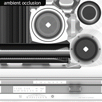
Ambient Occlusion ( source ) Ambient occlusion(AO) represents large scale occluded light and is generally baked from a 3d model.
Adding AO as a separate map as opposed to baking it into the albedo and specular maps allows the shader to use it in a more intelligent way. For instance, the AO function only occludes ambient diffuse light (the diffuse component of the image based lighting system in Toolbag 2), not direct diffuse light from dynamic lights or specular reflections of any kind.
AO should generally not be multiplied on to specular or gloss maps. Multiplying AO onto the specular map may have been a common technique in the past to reduce inappropriate reflections (e.g. the sky reflecting on an occluded object) but these days local screen space reflections do a much better job of representing inter-object reflections. Cavity ( source ) A cavity map represents small scale occluded light and is generally baked from a 3d model or a normal map. An easy and painless way of creating a cavity map would be by using NDO2 wherein it generates it via a normal map.
A cavity map should only contain the concave areas (pits) of the surface, and not the convex areas, as the cavity map is multiplied. The content should be mostly white with darker sections to represent the recessed areas of the surface where light would get trapped. The cavity map affects both diffuse and specular from ambient and dynamic light sources.
Alternatively, a reflection occlusion map can be loaded into the cavity slot, but be sure to set the diffuse cavity value to 0 when doing this.
Linear Lighting - Linear Intensity Response ( source ) When you are using gamma space lighting, the colors and textures that are supplied to a shader have a gamma correction applied to them. When they are used in a shader the colors of high luminance are actually brighter than they should be for linear lighting. This means that as light intensity increases the surface will get brighter in a non linear way. This leads to lighting that can be too bright in many places, and can also give models and scenes a washed-out feel. When you are using linear lighting, the response from the surface remains linear as the light intensity increases. This leads to much more realistic surface shading and a much nicer color response in the surface.
Typically PBR shaders use Linear Colour Space. ( source )
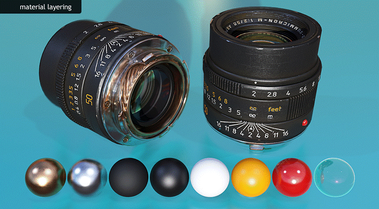
Example of Texture Maps
Please note the metalness map approach was used in this scenario. ( source )
Please note the specular map workflow was used in this scenario. ( source )
Creating Texture Content ( source )
There are many ways to create texture content for PBR systems; the exact method you choose will depend on your personal preferences and what software you have available to you. Here is a quick recap of the method I used to create the lens above:
First, basic materials were created in Toolbag for each surface type using a combination of tiling textures from Megascans, measured data from known materials, and where lacking appropriate reference, logic and observation, to determine the values. Creating the base materials in Toolbag allows me to quickly adjust values and offers a very accurate preview of the end result. Tip: Often I assign base materials directly to my high poly model to get a clear idea of how the texture will come together before doing the final bakes.
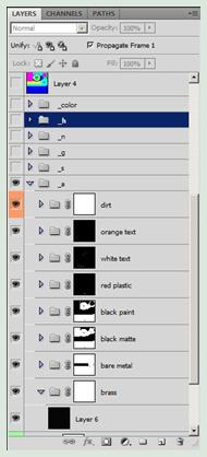
After setting up my base materials I brought the values and textures into Photoshop and started layering them in a logical manner. Brass at the bottom, nickel plating, matte primer, semi-gloss textured paint, paint for the lettering, and finally the red glossy plastic. This layering setup provides an easy way to reveal the various materials below with simple masks.
After I have my base layers set up and blended together to represent various stages of wear, I added some extra details. First I used dDo to generate a dust and dirt pass, and then I finished it off with fine surface variation in the gloss map.
The exact method you use to create content for a PBR system is much less important than the end result, so feel free to experiment and figure out what works best for your needs. However, you should void tweaking materials values to look more interesting in a specific lighting environment. Using sound base values for your materials can greatly simplify the process, increase consistency and asset reuse on larger projects, and will ensure that your assets always look great no matter how you light them.
Material Reference Values Should be considered as a general/base guideline and not the absolute/only value. This is because of various real world conditions, weathering, age, purity of material, etc. Some values will contradict each other (ex. water). Select or play with the present values and adjust accordingly, depending on the shader/engine you are using. Refraction Index of Various Substances for 3D Modelers - click here Porosity The Dontnod chart include an unusual parameter named Porosity. This parameter is the “open porosity” of a material. It can be used for driving weathering and aging effect (Pollution, rain, aging…). More details on its usage can be found in previous blog post: Water drop 3a – Physically based wet surfaces and Water drop 3b – Physically based wet surfaces. In practice Dontnod use it mainly with the dynamic wet formula provided in the mentionned previous post. The range is remapped from 0-1 to 0-70% of open porosity. There is real worl image to try to give a feeling of what the value mean. An extremely porous material is the clay (70%), but open porosity can vary a lot for same material, clay could also be only 50%.
Base Colour Base Color simply defines the overall color of the Material. It takes in a Vector3 (sRGB 0-255) value and each channel is automatically clamped between 0 and 1. If taken from the real world, this is the color when photographed using a polarizing filter (polarization removes the specular of nonmetals when aligned).
Measured BaseColour values for nonmetals (intensity only):
Measured BaseColours for metals:
The diffuse part of the base color (the one use by the non-metallic) must be in the range of the first gradient 50-243. There is some sample values of real world material in sRGB below the gradient. Some of these values are base on real world measured material (from misc sources, not done by us) and other are have been generated by Laurent Harduin. He take calibrated raw picture of representative material, take the luminance histogram in Photoshop and use the value of the medium axis for the luminance. Then he blur the picture and take one pixel inside the blurred region and use that as the color value. This explain why in few case like the clean cement the color and the luminance doesn’t match perfectly. We also lower a bit the value to take into account the invevitable specular present during the capture.
The reflectance part (the one use by metallic) must be in the range 186-255 (not present in the chart). Some example are provided below the grey square. Most of the time the metallic color of material match what the eye see.
Roughness The Roughness input literally controls how rough the Material is. A rough Material will scatter reflected light in more directions than a smooth Material. This can be seen in how blurry or sharp the reflection is or in how broad or tight the specular highlight is. Roughness of 0 (smooth) is a mirror reflection and roughness of 1 (rough) is completely matte or diffuse.
(please refer to the above image as reference) The gradient display roughness from 0 for smooth (left) material to 1 for rough material (right). The grey gradient are from 0 to 255 and red segments are displayed every 1/10 with a sphere like object below to show the in-game result of the designated value. The first row of real world image above represent no metallic object, the second row represent metallic object. Goal is to give artist a better feeling of what is roughness. The first row of sphere like object represent metallic object, the second row represent non-metallic object. Note: The roughness here is coupled with the BRDF used by the Unreal engine 4, it may not be compatible with other engine or offline renderer.
Roughness 0 to 1. Nonmetal top, metal bottom.
Roughness is a property that will frequently be mapped on your objects, in order to add the most physical variation to the surface.
If you have been making Materials in previous iterations of the Unreal Engine and are not accustomed to physically-based Materials, keep in mind that Roughness maps are where you will handle most of your Specularity texturing.
Metallic The Metallic input literally controls how "metal-like" your surface will be. Nonmetals have Metallic values of 0, metals have Metallic values of 1. For pure surfaces, such as pure metal, pure stone, pure plastic, etc. this value will be 0 or 1, not anything in between. When creating hybrid surfaces like corroded, dusty, or rusty metals, you may find that you need some value between 0 and 1.
Specular (Reflectance) The Specular input should not be connected and left as it's default value of 0.5 for most cases.
The best way to visualize these concepts is to load up TB2/EU4, add a sphere, and play with simple parametric materials. Adjust the gloss/roughness values, observe how the reflections change. Play with the metalness value, etc.
UE4 - Biggest Difference ( source ) UE4 does NOT use the Albedo map the same way another engine would strangely enough. It is referred to a “Base Colour” and instead of metals being more or less black, they are actually the opposite. Visit the source or visit UE4 - The Difference for more information. sRGB Color Space (gamma) ( source ) Be aware that you are working in sRGB color space on your monitor when painting a texture. In sRGB space, a 50% mid-gray is not 0.5 or 127 but rather 0.5 raised by the inverse of gamma 2.2 which equals 187 in Photoshop. In a nutshell, the reason that sRGB is used is to avoid banding artifacts. In sRGB space you get more precision for darker colors to which the human eye is more sensitive. Before working on colors, please make sure that your screen is calibrated properly. Spacing per Map ( source ) Diffuse/Albedo maps are generally gamma space. Specular maps generally are Gamma space. Gloss/Roughness maps should generally be linear space (sRGB off), but its not a big deal if you use sRGB/Gamma space.* Normal maps should always be linear space (sRGB off). There isn’t a huge emphasis on colour spacing for PBR but it is noted in many sources because those sources are trying to cover all basis and explain the nature of this genre.
Photoshop Setup ( source ) Verify that your Photoshop color management is set up properly. You can access the Color Settings from the menu via Edit->Color Settings... RGB should be set to sRGB and Gray to Gray Gamma 2.2 By default, Gray is often set to Dot Gain 20% which will result in a color transformation in the alpha channel. A value of 127 will come into the engine as 104 in that case which can cause inconsistencies, so please make sure Gamma 2.2 is used instead.
Some Nifty Time-Saving Tips! ( source ) ● The gloss map is one of the most important textures. With the gloss map you can give some history to an asset. For example, make parts of an object that were touched a lot by people less rough. ● For non-metal objects, don't waste time with a specular map but focus rather on the gloss map. This will also help to save memory, as a constant specular material color is enough in most cases. ● Put variation into the gloss map. Not just random noise but think really where the object would be less or more rough. ● Always test the specular reaction of objects/materials, by rotating them against a light source and viewing them from different angles. Specular is what gives objects the sense of volume and breaks the flat look. ● Make sure that the lighting is setup properly when testing assets (you can use a special asset test level with calibrated lighting). ● If an object has the correct physical specular color but you see hardly any specular highlights on top of the diffuse, the gloss is likely too low. Try to increase the brightness of the gloss map. ● [CE3] To see just the specular without any diffuse, put the Diffuse Color to black in the material editor. ● [CE3] Use the histogram in the material editor to identify issues in the material setup. You can easily judge the overall brightness of textures using the histogram. Deciding Which Values to Use for Materials ( source ) Gather reference for each material type/part of the object. Start by doing a rough block in for each material type, this doesn’t have to be exact but should be close enough so that you have a good base to start tweaking from.
For each material I start with the reflectance value, these can be found in various charts online, if I can’t find a reflectance value for a certain material, I try to determine it with logical reasoning (ie, worn out rubber will be less reflective, brass is a mix of copper and zinc, etc).
Reflectance values are the easiest to start off with, and give you a good base for the other maps. For insulators, its important to keep to keep the values within the small range that non-metals typically reflect. For metals, its important to make the diffuse black first, and then find the appropriate reflectance value. After this I will assign a quick roughness value, usually by just sorting materials into 3 categories (shiny, middle or rough). Then I pick an albedo color, paying attention here to keep things consistent and not too dark. I also toggle through various skies to make sure the materials are consistent in a variety of lighting conditions. Once this initial stage is over I fall back on observation for the fine tuning these values, since every material is different, keeping in mind the concepts of PBR. At this point I like to add a basic overlay to the normal map for materials that have a strong surface variation, such as bumpy plastic.
Its important to remember that values in the reflectance map only change when there is an actual change in material. Colour Space Confusion and Why It Matters ( source ) Gloss/roughness maps and metalness maps tend to be linear space as well, but they don't necessarily have to be. From a practical perspective, any input that defines a percentage value (like gloss and metalness), makes sense to use linear color space for the texture input. This is so you can easily mock up a material will a parametric input in your shader (which tends to be linear space), and then easily duplicate that value in photoshop by selecting the color with the brightness input in the color picker. The values for these maps will not be accurately visualized in photoshop though (which works in gamma space by default), so its important to verify the results in the actual shader/game/renderer and not worry about what it looks like in 2D.
Generally it's important for this to be consistent throughout your project, which maps are in linear or gamma space. Its not something that should vary per asset, so talk to your technical artist, engineers, etc if you're confused about which to use. Again, you don't need to set photoshop up in a special way to use linear space textures, just remember to check the final result in game. There are some more technical things to consider, like if you're using gamma space specular but find a measured reflectance value in linear space. In that case you will need to convert the values.
Lastly, all your textures do not need to be linear space "to be pbr", I've heard this before, I'm not sure what the source of this information is but its factually incorrect. Color space simply defines how much precision is used for the darker values (more in the case of sRGB) vs a linear distribution of precision for the data (linear space). Color space in regards to texture inputs actually has nothing to do with physically based rendering (other than the fact that you may need to convert your measured base values - which depends on the source of said values). However, most renderers that have PBR shaders, the renderer itself is in linear space(for a variety of technical reasons), but this is something different entirely.
Dealing with Elements like Rust ( source ) [Metalness workflow] In 99% of cases, metals should be black or white but rust is an exception. You really don't want midtones unless you are blending between two materials ( non metal and metal). Especially with something like rust. You will end up with something that is giving off orange specular (which rust doesn't) and is very dark in the diffuse. I would keep it close to either end of the spectrum, but not in between. The areas which are only lightly rusted, are quite significantly less reflective than the un-rusted areas. But maybe you would still want a metalness value of 0.1 or 0.2 or something, as its probably a bit more reflective than 0.04.
Minor science bit here: You may remember from school that chemical reactions are irreversible, and usually happen "instantly". the same is true of oxidation, once a molecule becomes oxidized it stays that way forever. That's why when you want to get a rust patch cleaned off of your car, you have to sand it right down to the bare metal and treat it from there.
Now, how to apply that to your metalness map: Start off with white, this is your metallic layer, which will always be underneath the oxidized layer. then take a black brush, and adjust the opacity of the brush to reflect how THICK you want the layer of oxidation to be. the thicker the layer of oxidation, the blacker it becomes. It's possible to have a very fine/thin layer of oxidation that still allows a lot of light to be reflected by the underlying metal, but it's also possible for the oxidation to become so thick that no light can be reflected by the metal beneath.
Of course, as with everything, this isn’t the only way to approach this and is just one method someone prefers. Don’t get caught up with steps and following everything to the letter because another approach to the above would to alter the albedo/spec map more than the metalness map, etc. Refer to the tutorial/examples section for more information.
Examples Tileable Dirt & Pebbles Texture - click here Some Environment Textures - click here Cutting Torch - click here PBR Stylized Dagger - click here Video PBR Theory Explained - click here PBR in Substance Designer - click here Additional Readings & References Comprehensive Guide Vol.1 - The Theory of Physically based Rendering - click here Vol.2 - Practical Guidelines for PBR Texturing - click here General UDK Physically Based Lighting - click here Free Engines Supporting Physically Based Lighting - click here TGA Physically Based Lighting CGFX Shader for Maya Viewport - click here Science & Theory Water Drops & Wet Surfaces PBR - click here Sebastien Lagarde’s Adopting a physically based shading model Feeding a Physically Based Lighting Mode - click here SIGGRAPH 2014 Course: Physically Based Shading in Theory and Practice - click here John Hable’s excellent blog post: Everything Is Shiny John Hable’s even better blog post: Everything Has Fresnel The SIGGRAPH 2010 course on PBR Always worth mentioning: The Importance of Being Linear Slideshow of Real Shading in Unreal Engine 4 Mike Seymour’s Monsters University: rendering physically based monsters Physically Based Rendering - From Theory to Implementation Crytek’s PBR Presentation ft. Ryse - Moving to the Next Generation - The Rendering Technology of Ryse Practice Sébastien Lagarde’s summary of Rendering Remember Me Discussions Polycount discussion on PBR - click here Polycount PBR Texturing Process Q&A - click here Reddit Star Citizen PBR Discussion - click here FAQ Standalone Programs Substance Designer - Next-Gen Texturing - material layering workflow; node based; standalone program; great for uniques or tileables Substance Painter - 3D Painting Software - great for unique baked textures Quixel's Megascans - a material library like never before Mari - a 3D painting tool
Notable Artists Joshua Lynch - one of the pioneers in the use of Designer, godly work Bradford Smith - another early adopter that paved the way for a lot of artists Daniel Thiger - Lead Environment Artist over at Bungie. Phenomenal organic work Stefan Groenewoud - perfect example of a mixture of old school (zbrush) and new school (designer) texturing. Artist at Guerrilla Games (Horizon Zero Dawn) Peter Sekula - incredible intricate and detailed texture work (some in designer, others in painter, etc)
PHYSICALLY BASED RENDERING ENCYCLOPEDIA v. 0.96 (Dec. 19, 2017) Compiled by: Brian Yu (3py0n)
There is no one way to accomplish a task, more specifically in texturing. The below is a guideline of the most common and effective routes currently and is by no-means the only way to texture for PBR. Final name of this document is in consideration. ENJOY! Introduction An emporium/bible of sorts wherein I will try to encompass all there is to know about creating physically based materials for the next-gen. I am still new to PBR texturing and am learning as I make this bible. The reason for me making this is to have a central database for artists and developers to look at to help them with their workflow. It’s also a great way for people who are new to PBR to learn more. Please note that this is just a general guide/bible and is not the end-all-be-all. That is to say, there is typically not only 1 way of doing things. Before I finish, this document is also for people who have prior knowledge in texturing and making 3D art in general.I would like to take this opportunity to thank all the wonderfully talented and innovative people who I sourced from for their work on this subject matter. :) PS: This is more for the artistic side and less of the math/deep calculations and how it works exactly, etc.
Copyright I do not pretend to own all of what I am stating in this document. Some parts will be from my personal experience/knowledge while other parts will be excerpts taken from sources (credit will be identified at the beginning of a section).
|
Последнее изменение этой страницы: 2019-04-01; Просмотров: 543; Нарушение авторского права страницы