|
Архитектура Аудит Военная наука Иностранные языки Медицина Металлургия Метрология Образование Политология Производство Психология Стандартизация Технологии |
|
|
Архитектура Аудит Военная наука Иностранные языки Медицина Металлургия Метрология Образование Политология Производство Психология Стандартизация Технологии |
Microsurface (Roughness/Gloss)
Most real-world surfaces have very small imperfections: tiny grooves, cracks, and lumps too little for the eye to see, and much too small to represent in a normal map of any sane resolution. Despite being invisible to the naked eye, these microscopic features nonetheless affect the diffusion and reflection of light.
Microsurface detail has the most noticeable effect on reflection (subsurface diffusion is not greatly affected and won’t be discussed further here). In the diagram to the left, you can see parallel lines of incoming light begin to diverge when reflected from a rougher surface, as each ray hits a part of the surface with a different orientation. In short, the rougher the surface gets, the more the reflected light will diverge or appear “blurry”.
Unfortunately, evaluating each microsurface feature for shading would be prohibitive in terms of art production, memory use, and computation. So what are we to do? It turns out if we give up on describing microsurface detail directly and instead specify a general measure of roughness, we can write fairly accurate shaders that produce similar results. This measure is often referred to as “Gloss”, “Smoothness”, or “Roughness”. It can be specified as a texture or as a constant for a given material.
This microsurface detail is a very important characteristic for any material, as the real world is full of a wide variety of microsurface features. Gloss mapping is not a new concept, but it does play a pivotal role in physically-based shading since microsurface detail has such a big effect on light reflection. As we will soon see, there are several considerations relating to microsurface properties that a PBR shading system improves upon.
Microsurface gloss directly affects the apparent brightness of reflections. This means an artist can paint variations directly into the gloss map – scratches, dents, abraded or polished areas, whatever – and a PBR system will display not just the change in reflection shape, but relative intensity as well. No “spec mask”/reflectivity changes required!
This is significant because two real world quantities that are physically related – microsurface detail and reflectivity – are now properly tied together in the art content and rendering process for the first time. This is much like the diffusion/reflection balancing act described earlier: we could be authoring both values independently, but since they are related, the task is only made more difficult by attempting to treat them separately.
Further, an investigation of real world materials will show that reflectivity values do not vary widely (see the earlier section on conductivity). A good example would be water and mud: both have very similar reflectivity, but since mud is quite rough and the surface of a puddle is very smooth, they appear very different in terms of their reflections. An artist creating such a scene in a PBR system would author the difference primarily through gloss or roughness maps rather than adjusting reflectivity, as shown above.
Microsurface properties have other subtle effects on reflection as well. For example, the “edges-are-brighter” Fresnel effect diminishes somewhat with rougher surfaces (the chaotic nature of a rough surface ‘scatters’ the Fresnel effect, preventing the viewer from being able to clearly resolve it). Further, large or concave microsurface features can “trap” light – causing it to reflect against the surface multiple times, increasing absorption and reducing brightness. Different rendering systems handle these details in different ways and to different extents, but the broad trend of rougher surfaces appearing dimmer is the same.
This section only serves as a very basic and introductory lesson to the world of PBR. I won’t be going in-depth on the math and science behind it as more links will be provided in the additional references section. However after reading this section, one should be familiar enough with how PBR works now to understand the rest of this document.
Gloss Additional Info ( source ) From my point of view, the most difficult texture to author is gloss. Reasons are as follows: ■ Specular power range deduced from gloss values is completely dependent of your engine. ■ A lot of the detail is contained here compared to the previous method wherein details were spread out through all the maps ■ Values are numerical, neither color nor vector. Details like scratches, pores, grooves, etc can be added even without them being in the normal map. Hence why this map is also referred to as microsurface.
Guidelines & Basics: The How-To Guide This section will cover the basics of creating art in the PBR workflow. It will do its best to answer questions before you even have them. It won’t get too technical however as that will be covered in another section if the need arises.
Artists who are unfamiliar with the concept of PBR systems often assume that content creation is drastically different, usually because of the terminology that is used. If you’ve worked with modern shaders and art creation techniques you already have experience with many of the concepts of a physically based rendering system.
Figuring out what type of content to create, or how to plug your content into a PBR shader can be confusing, so here are some common terms and concepts.
Advances in Technology Since the conception of this encyclopedia back in 2014 there has been so many advances in technology and the production side of art, so much so that a lot of the how-to guide is outdated but I will still leave it in (partially to show what texturing was like pre-Painter and also just for those information junkies). From the Quixel suite making huge strides to Allegorithmic releasing newer and better tools for the pipeline (Substance Painter & Designer), it’s been easier than ever to have materials that resemble their real-world counterparts. But tread lightly as heading this also makes one’s base knowledge of how to get to life-like materials weak. You’re essentially pushing and pulling sliders, which is totally fine! It speeds up workflow and produces faster and better results, but sometimes it’s nice to know where things started/came from. In spite of this, the Substance library makes it very easy to produce fantastic results with minimal effort (compared to before when one had to author each map individually, manually) but also leaves room for some faking of materials (maybe throwing up the metalness slider up to achieve a certain look). Just be wary and informed.
Most Common Workflows 1. Albedo, Specular/Reflection, Roughness/Gloss, Normals, anything else (i.e. detail normals, separate AO/cavity, etc depending on need and shader) 2. Albedo/Specular in 1 map, Metalness, Roughness/Gloss, Normals, anything else like #1 3. Any other workflow is purely depicted by the project, studio, engine, etc.
Guidelines for Creating Different Materials ( source ) The material substance is defined to a huge degree by the specular color. Use a reference table to pick the appropriate color for the desired material type.
Non-Metals ● Non-metal has monochrome/gray specular color. Never use colored specular for anything except certain metals unless certain of what you are doing ● [Specular] The sRGB color range for most non-metal materials is usually between 40 and 60. It should never be higher than 80/80/80. ● A good clean diffuse map is required. Metals ● The specular color for metal should always be above sRGB 180. ● Metal can have colored specular highlights (for gold and copper for example). ● Metal has a black or very dark diffuse color.
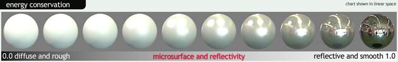
Energy Conservation ( source ) The concept of energy conservation states that an object can not reflect more light than it receives.
For practical purpose, more diffuse and rough materials will reflect dimmer and wider highlights, while smoother and more reflective materials will reflect brighter and tighter highlights.
Diffuse/Albedo ( source ) Diffuse/Albedo maps are generally gamma space and are quite flat colour wise. Albedo is pure colour, no lighting information baked in like we used to do with diffuse maps. ( source )
The diffuse color defines how bright a surface is when lit directly by a white light source with an intensity of 100%. More physically speaking, it defines which percentage for each component of the RGB spectrum does not get absorbed when light scatters underneath the surface. A diffuse map is always required. In most cases the diffuse color in the material editor should be set to white (255/255/255).
For pure metal materials, the diffuse color should be black as explained before. Rusty metal/oxidation however needs some diffuse color.
Please note the values below are a little outdated. ( source )
An albedo map defines the color of diffused light. One of the biggest differences between an albedo map in a PBR system and a traditional diffuse map is the lack of directional light or ambient occlusion. Directional light will look incorrect in certain lighting conditions, and ambient occlusion should be added in the separate AO slot.
The albedo map will sometimes define more than the diffuse color as well, for instance, when using a metalness map, the albedo map defines the diffuse color for insulators (non-metals) and reflectivity for metallic surfaces.
Specular/Reflection/Reflectivity ( source ) ( source 2 ) Specular/Reflection/Reflectivity maps generally are Gamma space. Reflectance is again, a measured value for a material. there are plenty of sources online which you can get the measured reflective colours for various materials. Typically speaking, most non-metals fall into a white 0.04 range (linear), while metals (having no albedo and being pure reflection) have much higher, coloured reflectance. ( source )
Reflectivity is the percentage of light a surface reflects. All types of reflectivity (aka base reflectivity or F0) inputs, including specular, metalness, and IOR, define how reflective a surface is when viewing head on, while Fresnel defines how reflective a surface is at grazing angles.
A spec map won’t be needed to directly set reflectivity (when using metalness workflow) but is still required in the alternative workflow. The spec map is combined with your diffuse in the form of the albedo map in the metalness workflow.
Specular color is a physical value now which is constant for a single type of material. So in essence, it will look quite flat compared to pre-PBR spec maps.
The specular color defines how much light gets reflected immediately from the surface when the light source is directly above the surface. This is the minimum specular intensity, under grazing angles it will increase due to the Fresnel effect. As the specular color is specific for a certain type of material, it can also be considered as a mask for the type of material/substance. The specular color is a physical value which should be picked directly from a reference table. As such, it does not leave much artistic freedom.
Please note the values below are a little outdated. ( source )
Its important to note how narrow the range of reflectivity is for insulative (non-metal) materials (see below). Combined with the concept of energy conservation it’s easy to conclude that surface variation should generally be represented in the microsurface map, not the reflectivity map. For a given material type, reflectivity tends to remain fairly constant. Reflection color tends to be neutral/white for insulators, and colored only for metals. Thus, a map specifically dedicated to reflectivity intensity/color (commonly called a specular map) may be dropped in favor of a metalness map.
Traditional specular maps offer more control over the the specular intensity and color, and allow greater flexibility when trying to reproduce certain complex materials. The main drawback to a specular map is that it generally will be saved as a 24 bit file resulting in more memory use. It also requires artists to have a very good understanding of physical material properties to get the values right, which can be a positive or negative depending on your perspective.
Most non-metals reflect 2% to 5% of the light as specular and the highlight is monochrome/gray. As the variation is so little, it is often enough to use a constant specular color instead of a specular texture map. However, if metal and non-metal are mixed in a single texture, it is required to use a specular map, as metal has a much brighter specular color than non-metal. If a specular map is used, the specular color in the material editor should be set to white which is 255/255/255, as it gets multiplied with the values from the specular map and would otherwise lower the physical values from the map.
Index of Refraction (IOR) ( source ) IOR is another way to define reflectivity, and is equivalent to the specular and metalness inputs. The biggest difference from the specular input is that IOR values are defined with a difference scale. The IOR scale determines how fast light travels through a material in relation to a vacuum. An IOR value of 1.33 (water) means that light travels 1.33 times slower through water than it does the empty vacuum of space. You can find more measured values in the Filmetrics Refractive Index Database.
Insulators (non-metal), IOR values do not require color information, and can be entered into the index field directly, while the extinction field should be set to 0.
Metals that have color reflections, will need a value for the red, green and blue channels. This can be done with an image map input (where each channel of the map contains the correct value). The extinction value will also need to be set for metals, which you can usually find in libraries that contain IOR values.
Using IOR as opposed to specular or metalness input is generally not advised, as it is not typically used in games, and getting the correct value in a texture with multiple material types is difficult. IOR input is supported in Toolbag 2 more for scientific purposes than practical.
Metalness ( source ) Metalness maps generally are Gamma space.
A metalness map is not more or less physically accurate than a standard specular map. It is, however, a concept that may be easier to understand, and a metalness map can be packed into a grayscale slot to save memory. The drawback to using a metalness map over a specular map is a loss of control over the exact values for insulative materials. (refer to the above image)
Protips ( source ) When using a metalness map: Insulative surfaces - pixels set to 0.0 (black) in the metalness map – are assigned a fixed reflectance value (linear: 0.04 sRGB: 0.06) and use the albedo map for the diffuse value.
Metallic surfaces – pixels set to 1.0 (white) in the metalness map – the specular color and intensity is taken from the albedo map, and the diffuse value is set to 0 (black) in the shader. Gray values in the metalness map will be treated as partially metallic and will pull the reflectivity from the albedo and darken the diffuse proportionally to that value (partially metallic materials are uncommon).
Metalness maps should use values of 0 or 1 ( some gradation can be okay for transitions). Materials like painted metal should not be set to metallic as paint is an insulator. The metalness value should represent the top layer of the material.
Marmoset Earthquake’s testimonial ( source ) So the way the metalness thing works is basically this: A. Your albedo map is both your diffuse and spec map B. The metanless map defines which sections are metal and which are not. But what its really doing is the more metal it is, the more it darkens the diffuse and pulls the specular intensity and color from the albedo. Black values in the metalness map represent non-metals, and for those, a low, fixed specular intensity is used (I don't remember the value off hand).
However, If you use mid-values in the metalness mask you can sort of hack it into doing what you want. You don't need to stick to black or white. But then it will pull the spec color from there as well, which works for things like Christmas ornaments, but not really for glossy plastics.
But really, if you want fine control over the specular color and specular intensity for non-metals, you shouldn't be using the metalness function, you should use the standard blinn-phong, as that will let you do exactly that. With energy conservation on, and a bright spec intensity value with blinn-phong, it will basically work the same as the metalness thing (ie: it will darken the diffuse to make it appear more metal-ish)
Is Metalness Map a requirement? ( source ) No, a metalness map is just one method of determining reflectivity and is generally not more or less physically accurate than using a specular color/intensity map.
If a metalness map is used, the spec and albedo maps are combined into one, thus the need for a separate spec map is negated.
Gloss/Roughness/Microsurface ( source ) ( source 2 ) Gloss/Roughness/Microsurface maps should generally be linear space (sRGB off), but its not a big deal if you use sRGB/Gamma space. Gloss defines the roughness/smoothness of a surface. Roughness is calculated in a specifically measure way and requires 0 - 1 input only. ( source )
Typically all the detail is located here. Scratches, wear, finger prints, etc are located in this map. It is more or less the same pre-PBR.
A a low gloss value means that the surface is rough while a high value means the surface is very smooth and shiny. The roughness influences the size and the intensity of specular highlights. The smoother/glossier a surface is, the smaller the specular highlight will be. A more narrow/smaller highlight will at the same time be brighter in order to obey to the rules of energy conservation.
A gloss map is used and creates interesting and plausible variation on the specular highlights.
Most materials should have a gloss map, as it can give a lot of good variation to the shading. Gloss is closely related to normal maps, as high frequency details in a normal can create some feeling of roughness as well. However, gloss is more the micro-scale roughness of the material.
Note how the specular highlight becomes smaller and brighter with an increasing gloss value, making the material look smoother (Image Source: Real-Time Rendering) Please note the values below are a little outdated. ( source )
Here we see the how the principles of energy conservation are affected by the microsurface of the material, rougher surfaces will show wider, but dimmer specular reflections while smoother surfaces will show brighter, but sharper specular reflections.
Depending on what engine you’re authoring content for, your texture may be called a roughness map instead of a gloss map. In practice there is little difference between these two types, though a roughness map may have an inverted mapping, ie: dark values equal glossy/smooth surfaces while bright values equal rough/matte surfaces. By default, Toolbag expects white to define the smoothest surfaces while black defines roughest surfaces, if you’re loading a gloss/roughness map with an inverted scale, click the invert check box in the gloss module.
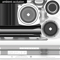
Ambient Occlusion ( source ) Ambient occlusion(AO) represents large scale occluded light and is generally baked from a 3d model.
Adding AO as a separate map as opposed to baking it into the albedo and specular maps allows the shader to use it in a more intelligent way. For instance, the AO function only occludes ambient diffuse light (the diffuse component of the image based lighting system in Toolbag 2), not direct diffuse light from dynamic lights or specular reflections of any kind.
AO should generally not be multiplied on to specular or gloss maps. Multiplying AO onto the specular map may have been a common technique in the past to reduce inappropriate reflections (e.g. the sky reflecting on an occluded object) but these days local screen space reflections do a much better job of representing inter-object reflections. Cavity ( source ) A cavity map represents small scale occluded light and is generally baked from a 3d model or a normal map. An easy and painless way of creating a cavity map would be by using NDO2 wherein it generates it via a normal map.
A cavity map should only contain the concave areas (pits) of the surface, and not the convex areas, as the cavity map is multiplied. The content should be mostly white with darker sections to represent the recessed areas of the surface where light would get trapped. The cavity map affects both diffuse and specular from ambient and dynamic light sources.
Alternatively, a reflection occlusion map can be loaded into the cavity slot, but be sure to set the diffuse cavity value to 0 when doing this.
Linear Lighting - Linear Intensity Response ( source ) When you are using gamma space lighting, the colors and textures that are supplied to a shader have a gamma correction applied to them. When they are used in a shader the colors of high luminance are actually brighter than they should be for linear lighting. This means that as light intensity increases the surface will get brighter in a non linear way. This leads to lighting that can be too bright in many places, and can also give models and scenes a washed-out feel. When you are using linear lighting, the response from the surface remains linear as the light intensity increases. This leads to much more realistic surface shading and a much nicer color response in the surface.
Typically PBR shaders use Linear Colour Space. ( source )
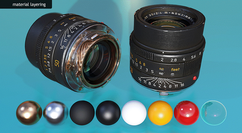
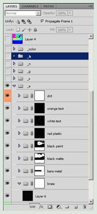
Example of Texture Maps
Please note the metalness map approach was used in this scenario. ( source )
Please note the specular map workflow was used in this scenario. ( source )
Creating Texture Content ( source )
There are many ways to create texture content for PBR systems; the exact method you choose will depend on your personal preferences and what software you have available to you. Here is a quick recap of the method I used to create the lens above:
First, basic materials were created in Toolbag for each surface type using a combination of tiling textures from Megascans, measured data from known materials, and where lacking appropriate reference, logic and observation, to determine the values. Creating the base materials in Toolbag allows me to quickly adjust values and offers a very accurate preview of the end result. Tip: Often I assign base materials directly to my high poly model to get a clear idea of how the texture will come together before doing the final bakes.
After setting up my base materials I brought the values and textures into Photoshop and started layering them in a logical manner. Brass at the bottom, nickel plating, matte primer, semi-gloss textured paint, paint for the lettering, and finally the red glossy plastic. This layering setup provides an easy way to reveal the various materials below with simple masks.
After I have my base layers set up and blended together to represent various stages of wear, I added some extra details. First I used dDo to generate a dust and dirt pass, and then I finished it off with fine surface variation in the gloss map.
The exact method you use to create content for a PBR system is much less important than the end result, so feel free to experiment and figure out what works best for your needs. However, you should void tweaking materials values to look more interesting in a specific lighting environment. Using sound base values for your materials can greatly simplify the process, increase consistency and asset reuse on larger projects, and will ensure that your assets always look great no matter how you light them.
|
Последнее изменение этой страницы: 2019-04-01; Просмотров: 713; Нарушение авторского права страницы